Direction (1-5): The line graph given below shows the production and consumption (in quintal) of Wheat in 5 different years of a village. Study the graph carefully and answer the following questions.
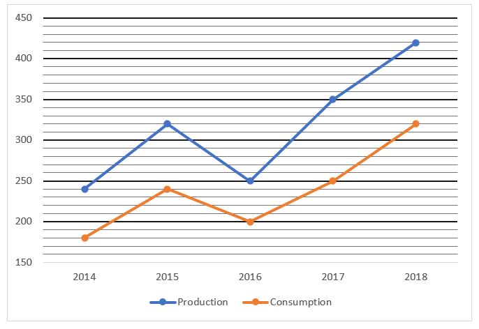
Q1. What is the average consumption of Wheat all over the years?
(a) 245 Quintals
(b) 254 Quintals
(c) 316 Quintals
(d) 238 Quintals
(e) 278 Quintals
Q2. Production of wheat in 2015 is what percentage more/less than that in 2016?
(a) 28%
(b) 33%
(c) 30%
(d) 25%
(e) 23%
Q3. What is the ratio between the consumption of wheat in 2016 and 2017 together to the production of wheat in 2014 and 2015 together?
(a) 45 : 53
(b) 45 : 56
(c) 12 : 17
(d) 15 : 17
(e) 30 : 53
Q4. If in 2019 the ratio between the production and consumption of wheat is 7 : 5 and total production of wheat is 280 Quintal, then consumption of wheat in 2019 is how much more/less than previous year?
(a) 150 quintals
(b) 180 quintals
(c) 140 quintals
(d) 120 quintals
(e) 220 quintals
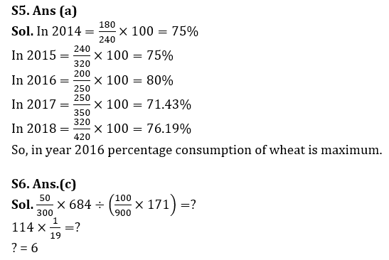
Q5. In which year percentage of consumption of wheat is maximum with respect to production?
(a) 2016
(b) 2018
(c) 2015
(d) 2017
(e) 2014
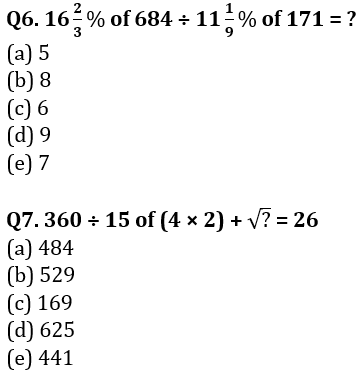
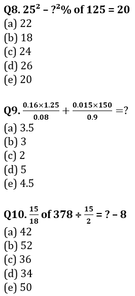
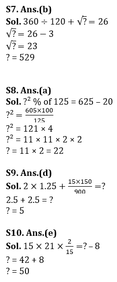
Directions (6-10): What value should come in place of (?) in the following questions?
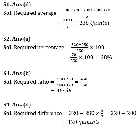
Solutions
. . . . .


 Quantitative Aptitude Quiz For Bank Main...
 Quantitative Aptitude Quiz For Bank Foun...


